
|
Be the first user to complete this post
|
Add to List |
Using d3js to draw a bar chart with an axis and some basic transitions
D3js lets you make your charts a bit more lively by adding simple transitions. In this post, we will build upon our previous article by giving our bar chart an x and y axis and give each bar a simple 'rising from the bottom' transition effect.
In this post, we will also refactor our previous example and make it a much more configurable chart.
The complete jsfiddle for this tutorial can be found here.
Before I begin, lets outline the various steps involved.
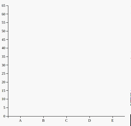
We start by creating our data and presetting some that we wish to have for our svg and some inner padding.
var employees = [
    {dept: 'A', age : 22},
    {dept: 'B', age : 26},
    {dept: 'C', age : 35},
    {dept: 'D', age : 30},
    {dept: 'E', age : 27}
];

var svgHeight = 400;
var svgWidth = 400;
var maxAge = 65; // You can also compute this from the data
var barSpacing = 1; // The amount of space you want to keep between the bars
var padding = {
    left: 20, right: 0,
    top: 20, bottom: 20
};
function animateBarsUp() {
    var maxWidth = svgWidth - padding.left - padding.right;
    var maxHeight = svgHeight - padding.top - padding.bottom;
}
Defining our conversion functions
With this knowledge, we can now define our conversion functions that can be used later to convert our raw data into pixel coordinates for the svg.
// Define your conversion functions
var convert = {
    x: d3.scale.ordinal(),
    y: d3.scale.linear()
};
Notice that we use an ordinal scale function in for x. Thats because we want to render the department titles on the x axis which is ordinal(i.e. follows an orderly sequence but there is no way to derive one item from the other)
NOTE: Keep in mind that although convert.x and convert.y might appear as variables at first glance, they are actually functions that can take an argument and return a transformed value depeneding upon its domain and range settings.
Setting up the axis functions
Now lets define the functions that will be used to render the x and y axis.
// Define your axis
var axis = {
    x: d3.svg.axis().orient('bottom'),
    y: d3.svg.axis().orient('left')
};

// Define the conversion function for the axis points
axis.x.scale(convert.x);
axis.y.scale(convert.y);
Now lets breathe some life into our conversion functions by defining their domain and range.
Setup the domain and range for the conversion functions
// Define the output range of your conversion functions
convert.y.range([maxHeight, 0]);
convert.x.rangeRoundBands([0, maxWidth]);

convert.x.domain(employees.map(function (d) {
        return d.dept;
    })
);
convert.y.domain([0, maxAge]);
Setup the drawing area
The next two steps are pretty simple, we prepare our SVG and the chart within it.
// Setup the markup for your SVG
var svg = d3.select('.chart')
    .attr({
        width: svgWidth,
        height: svgHeight
    });

// The group node that will contain all the other nodes
// that render your chart
var chart = svg.append('g')
    .attr({
        transform: function (d, i) {
          return 'translate(' + padding.left + ',' + padding.top + ')';
        }
    });
Drawing the axis
We will first quickly draw our axis
chart.append('g') // Container for the axis
    .attr({
        class: 'x axis',
        transform: 'translate(0,' + maxHeight + ')'
    })
    .call(axis.x); // Insert an axis inside this node

chart.append('g') // Container for the axis
    .attr({
        class: 'y axis',
        height: maxHeight
    })
    .call(axis.y); // Insert an axis inside this node
Drawing the bars
The next part involves joining data and adding as many bars as there are data points. You can checkout the post on data joining, domain and range if you have any doubts about how that is achieved.
var bars = chart
    .selectAll('g.bar-group')
    .data(employees)
    .enter()
    .append('g') // Container for the each bar
    .attr({
      transform: function (d, i) {
        return 'translate(' + convert.x(d.dept) + ', 0)';
      },
      class: 'bar-group'
    });
bars.append('rect')
    .attr({
        y: maxHeight,
        height: 0,
        width: function(d) {return convert.x.rangeBand(d) - 1;},
        class: 'bar'
    })
    .transition()
    .duration(1500)
    .attr({
    y: function (d, i) {
        return convert.y(d.age);
    },
    height: function (d, i) {
        return maxHeight - convert.y(d.age);
    }
});
Also Read:
- Render a d3 tree with a minimum distance between the tree nodes
- Selecting a node in d3js based upon the value of its data
- Render a d3js Tree as a React Component
- How to get the data of a node in d3
- A visual explanation of the Enter, Update and Exit Selections in D3js