
|
Be the first user to complete this post
|
Add to List |
d3 Fundamentals: Creating a simple bar graph
So, whats in a rectangle?
Rectangles are native to the svg specification like circles and groups and many other elements. A rectangle has a couple of attributes that are used to render it on an svg - x, y, width and height.
We will start out this article by taking just one data point and then try to draw a rectangle for that data point. Then, we will build upon the same concept and the stuff we learned in our previous posts to draw multiple rectangles in order to create our bar graph.
TIP: When working with svgs, having a cheatsheet of the various attributes of the valid svg elements can go a long way in helping you become more productive. You can find a really good one over here.
Drawing a rectangle itself in SVG is pretty simple. All you gotta do is specify the values of each of its attributes and you're good to go.
var chart = d3.select('.chart');
var bar = chart.append('g');
bar.append('rect')
  .attr('width', 20)
  .attr('height', 50);
Drawing our bar chart
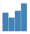
Assume that we want to plot a bar chart of the age of a few people and the data is available in an array as follows
var ages = [30, 22, 33, 45];
var totalWidth = 500;
var totalHeight = 200;
var scale = {
  y: d3.scale.linear()
};
scale.y.domain([0, 100]);
scale.y.range([0, 200]);
Appending the bars and adding nodes can be done as shown below. If you are'nt sure about how things are working, I suggest you quickly breeze through our article on selections before you proceed.
var chart = d3.select('.chart')
    .attr({
        'width': totalWidth,
        'height': totalHeight
    });

var bars = chart
    .selectAll('g')
    .data(ages)
    .enter()
    .append('g');
TIP : When you add child nodes to a node to which data is already bound, it inherits the data from its parent.
bars.append('rect')
    .attr({
        'x': function (d, i) {
            return i * barWidth;
        },
        'width': barWidth - 1,
        'height': scale.y
    });
bars.append('rect')
    .attr({
        'x': function (d, i) {
            return i * barWidth;
        },
        'width': barWidth - 1,
        'height': function (d, i) {
            return scale.y(d);
        }
    });
Turning it up
You must have noticed that the bar chart that we just drew appears inverted. Thats because in SVG, the top left is considered to be the origin - aka (x=0, y-0). While this works well for the computer, its doesnt really work that well for us.
Therefore in most graphs that you draw which need to be presented bottom(s)-up, you'd need to alter the scale functions for the y axis to produce the correct output.
In order to fix the bar graph in our example, we need to do two things
// ...
// ...
scale.y.range([totalHeight, 0]);
// ...
// ...
bars.append('rect')
    .attr({
        'x': function (d, i) {
            return i * barWidth;
        },
        'y': scale.y,
        'height': function (d) {
            // This is how much height is left over after
            // applying the inverted scale for the y axis
            return totalHeight - scale.y(d);
        },
        'width': barWidth - 1
    });
In the next post, we will learn how to add an x and y axis to our graph and add a very basic hover state to bars.
Follow us on twitter to get the next article the moment it gets freshly baked out of our oven.
Also Read:
- Selecting a node in d3js based upon the value of its data
- Creating an Animated Ring or Pie chart in d3js
- Render a d3 tree with a minimum distance between the tree nodes
- A visual explanation of the Enter, Update and Exit Selections in D3js
- How to get the data of a node in d3