
|
Be the first user to complete this post
|
Add to List |
Using css3 calc in an attribute value to compute its value at runtime
calc value in css is relatively new but pretty powerful.The calc value lets you do two important things
The calc attribute value can be used anywhere a length, frequency, angle, time, number, or integer value is required.
Before you adopt it in your application, make sure its browser compatibility matches your business requirements.
Basic example
Consider the following snippet
<div class="outer">
  <div class="inner"></div>
</div>
.outer {
  width: 500px;
  height: 100px;
  background: #dadada;
}

.inner {
  width: calc(100% - 40px);
  height: 50px;
  margin: auto;
  border: 1px solid blue;
}
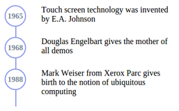
Creating a chronological timeline
I have always wanted to create a timeline with connectors. Until now, this wasnt possible without doing hacks. But the new calc property makes is so much simpler.
Consider this html structure
<div class="chronology">
    <div class="event">
        <div class="connector"></div>
        <div class="event-details">
            <div class="col-1">
                <div class="baloon">1965</div>
            </div>
            <div class="col-2">
                <div class="headline">Touch screen technology was invented by E.A. Johnson</div>
            </div>
        </div>
    </div>
</div>
.chronology {
    margin: 20px;
}
.event {
    float: left;
    position: relative;
    padding-bottom: 20px;
}
.baloon {
    border-radius: 50%;
    color: #768696;
    height: 42px;
    width: 42px;
    text-align: center;
    font-size: 15px;
    margin: 0 30px;
    line-height: 2.6em;
    font-weight: bold;
    border: 2px solid #8A97ED;
    box-sizing: border-box;
}
.connector {
    position: absolute;
    left: 51px;
    top: 42px;
    width: 2px;
    height: calc(100% - 42px);
    background-color: #8A97ED;
}
.event-details {
    display: block;
}
[class|="col"] {
    box-sizing: border-box;
    float: left;
    margin-left: 0;
}
.col-2 {
    width: 270px;
    position: relative;
}
.headline {
    width: 250px;
}
Also Read:
- Making max width work in internet explorer
- css specificity interview question
- pseudo elements vs pseudo classes
- How to set a box shadow on left or right only or just on a single slide